
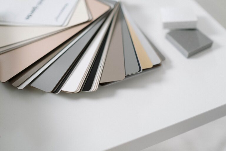
Choosing calm colors for your home can make your rooms feel more comfortable, balanced, and inviting. Soft shades can create a peaceful backdrop for daily life, while also making it easier to relax, focus, and enjoy your surroundings.
Calm colors do not have to be plain or boring. The right combination of warm neutrals, muted blues, gentle greens, and soft earth tones can add character without making a room feel busy. The key is to consider how colors work with your lighting, furniture, and the way you use each space.
Start With the Feeling You Want
Before choosing paint or accessories, think about how you want the room to feel. Color can influence the overall mood of a space, even when the changes are subtle.
For a restful bedroom, you may prefer quiet shades such as:
– Pale blue
– Soft sage green
– Warm white
– Light gray
– Muted lavender
For a living room, consider colors that feel relaxed but still welcoming, including:
– Sand
– Mushroom
– Greige
– Dusty blue
– Soft olive
A home office may benefit from calm colors that help the room feel clear and organized. Light gray-green, warm beige, or a muted blue can provide a gentle background without competing for attention.
Understand Warm and Cool Colors
Colors are often described as warm or cool. Understanding this difference can help you create a room that feels comfortable rather than unbalanced.
Warm colors include shades with hints of yellow, red, or orange. Warm whites, beige, tan, and soft terracotta can make a room feel cozy and friendly. They are especially useful in spaces with limited natural warmth or rooms that face north.
Cool colors include shades with hints of blue, green, or violet. Pale blue, blue-gray, and soft green can make a room feel fresh and airy. These colors often work well in sunny rooms or spaces where you want a lighter, more open feeling.
You do not have to choose only warm or only cool colors. A balanced room may pair a cool wall color with warm wood furniture, or a warm neutral with cool gray textiles.
Choose Muted Shades for a Softer Look
Bright colors can be energetic, but highly saturated shades may feel too strong if your goal is a calm atmosphere. Muted colors contain more gray, white, brown, or black, which softens their appearance.
For example, instead of a bright green, try sage or eucalyptus. Instead of a vivid blue, consider dusty blue or blue-gray. Rather than a strong yellow, look for a pale butter or warm cream.
Muted colors are often easier to live with because they blend naturally with other shades. They also provide a flexible background for artwork, plants, rugs, and furniture.
Pay Attention to Natural Light
Light has a major effect on how a color looks. The same paint can appear different throughout the day and from one room to another.
Consider these general guidelines:
– North-facing rooms often receive cooler, softer light. Warm neutrals, creamy whites, and gentle beige can help balance the space.
– South-facing rooms usually receive more direct sunlight. Cool gray, soft blue, or muted green can help keep the room from feeling too warm.
– East-facing rooms have brighter morning light and softer afternoon light. Gentle warm shades can work well here.
– West-facing rooms tend to have stronger afternoon and evening light. Cooler neutrals may help create balance.
Artificial lighting also matters. Warm bulbs can make cream, beige, and tan appear richer. Cooler bulbs may bring out blue or green undertones. Always test color samples under the lighting you use most often.
Test Colors Before Making a Decision
Looking at a small paint chip is helpful, but it does not show the full story. A color may look lighter, darker, warmer, or cooler once it covers a larger area.
Try these steps before committing:
- Paint large sample boards or sections of the wall.
- Place samples on more than one wall.
- Look at them in the morning, afternoon, and evening.
- View the colors beside flooring, furniture, trim, and curtains.
- Leave the samples in place for several days.
If you are comparing several colors, avoid placing too many samples close together. Different shades can affect how you see one another and make the comparison less accurate.
Build a Simple Color Palette
A calm room usually works best with a limited color palette. Start with one main color, then add supporting shades and small accents.
A simple approach is the 60-30-10 guideline:
– About 60 percent of the room is the main color, such as walls or large furniture.
– About 30 percent is a supporting color, such as curtains, rugs, or upholstery.
– About 10 percent is an accent color, used in pillows, artwork, or accessories.
For example, a room might use warm white on the walls, light wood and beige for the supporting colors, and muted blue in small decorative details.
This guideline is flexible. You can use more than three colors, but keeping the palette related will help the space feel organized.
Use Neutrals With Care
Neutrals are popular for calm interiors because they are easy to combine and rarely overwhelm a room. However, not all neutrals look the same.
Warm neutrals include cream, oatmeal, sand, taupe, and beige. Cool neutrals include blue-gray, stone, and certain shades of white. Some neutral colors may look balanced, while others have noticeable yellow, pink, blue, or green undertones.
When choosing a neutral, compare it with the existing elements in your home. A gray wall may appear too cool beside warm wood floors, while a yellow-based beige may clash with blue-gray furniture.
Layering several related neutrals can add depth. Combine different textures, such as linen, wool, cotton, wood, and ceramic, so the room does not feel flat.
Bring in Nature-Inspired Colors
Colors drawn from nature often create a calm and familiar feeling. Soft greens, cloudy blues, sandy beige, clay, and warm brown can work in many areas of the home.
Nature-inspired colors are particularly useful when paired with natural materials. Try combining:
– Sage green with light oak
– Soft blue with woven fibers
– Warm beige with stone
– Muted terracotta with cream
– Olive green with dark wood
Houseplants, baskets, wood accessories, and natural fabrics can also support the color palette without adding strong visual contrast.
Consider the Whole Home
Each room can have its own personality, but a home feels more connected when the colors relate to one another. This does not mean every wall needs to be the same color.
Choose a few shared colors or undertones that appear throughout the home. For example, warm white trim, light wood, or soft gray accents can create continuity between rooms. You might use pale blue in the bedroom, blue-gray in the bathroom, and a neutral with blue undertones in the hallway.
Open floor plans benefit from especially careful planning. Colors that are visible from one room to another should complement each other rather than compete.
Add Contrast in Small Doses
A calm color scheme still needs some contrast to remain interesting. Without contrast, a room may feel washed out or unfinished.
Add gentle contrast through:
– Darker wood furniture
– Black or bronze hardware
– Medium-toned rugs
– Textured fabrics
– Framed artwork
– Green plants
The goal is not to make every element the same lightness. A few deeper tones can help the softer colors stand out and give the room structure.
Avoid Choosing Colors in Isolation
Paint is only one part of a room. Before making a final decision, consider the colors already present in your flooring, countertops, cabinets, furniture, and textiles.
If your room has strong patterns, choose a quieter wall color that appears within those patterns. If the furniture is neutral, you may have more freedom to add a muted color to the walls or accessories.
Also think about how much maintenance the space requires. Very pale shades can show marks more easily in busy areas, while medium-toned colors may be more practical for hallways, entryways, and family rooms.
Final Thoughts
Choosing calm colors is about creating balance, not following a strict set of rules. Start with the mood you want, study the light in each room, and test colors alongside the elements you already own.
Soft, muted shades often provide the most flexibility, while natural textures and small touches of contrast keep the design inviting. With a thoughtful palette, your home can feel peaceful, comfortable, and personal without looking dull or overly matched.